If you want to learn how to create a reusable table component with react js and bootstrap to display data in a beautiful tabular format in your application with less code and higher reusability within just 10 mins then please read through this post and you will be a PRO in creating reusable table component in ReactJS.
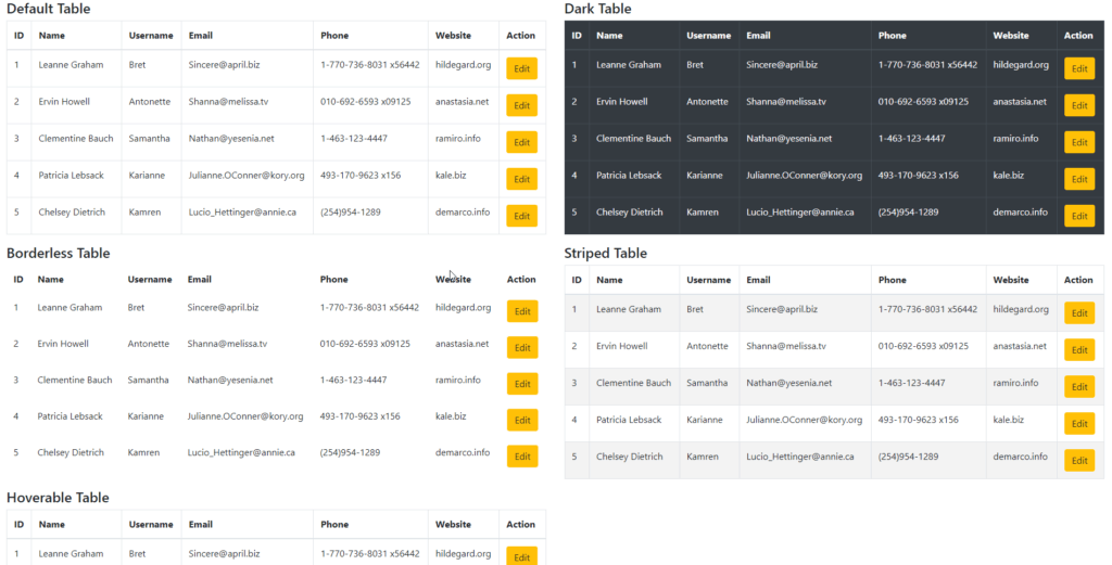
Final Output
Why we need a reusable table component?
After developing numerous applications in ReactJS,I have found a pattern of some components such as Table, Form Inputs, Buttons, Modals these are some types of components we need most of the time and writing it again and again to every component we have more number of lines which is almost duplicate and does almost the same thing only the data it reflects or action it performed are different.
So I created a playlist of Reusable form component with React on Youtube you can watch it here. Today I will be sharing table component with you guys which I have created in just 10 mins and saved my days of work in displaying tabular data in my applications.
Table component's HTML is almost the same the only thing changes is the data we pass to the table, so why not make it reusable and save time in the future development of the application and this will help us keep code clean, tested, and maintainable.
Approach
We will create a Table component that will take a constant [array] as a prop which will be responsible for printing the columns in the UI with the desired values. Data will be passed to be iterated and display the records and some helper props which can help us modifying the table's outlook on the UI.
Dependencies
Implementation
Lets first create a new react project with create-react-app.
npx create-react-app react-reusable-table-component
Now let's add the bootstrap package to our app
npm i -S bootstrap

yarn add bootstrap
now add bootstrap CSS to src/index.js to enable bootstrap in our application
import 'bootstrap/dist/css/bootstrap.css';
Now we will create our constant file which will be responsible to handle all the columns to be presented inside the table and we can have a glimpse of what we have to handle in our table component to render the data accordingly and our component should be generic too.
import React from 'react';

// This is the table constant/settings which needed to render table elements
export const tableConstants = (handleEdit) => {
  return [
    {
      title: 'ID',
      render: rowData => {
        return <span>{rowData.id}</span>;
      },
    },
    {
      title: 'Name',
      render: rowData => {
        return <span>{rowData.name}</span>;
      },
    },
    {
      title: 'Username',
      render: rowData => {
        return <span>{rowData.username}</span>;
      },
    },
    {
      title: 'Email',
      render: rowData => {
        return <span>{rowData.email}</span>;
      },
    },
    {
      title: 'Phone',
      render: rowData => {
        return <span>{rowData.phone}</span>;
      },
    },
    {
      title: 'Website',
      render: rowData => {
        return <span>{rowData.website}</span>;
      },
    },
    {
      title: 'Action',
      render: rowData => {
        return <button className='btn btn-warning' onClick={handleEdit(rowData)}>Edit</button>
      },
    },
  ];
};
Now as you see we have an array of elements with title and render property in the constant. the title will be used to display table header and render function will be used to render body element.
I have used render as a function which returns JSX to be displayed to table td element so that we can target styling for each cell conditionally or unconditionally like you can see the last element I used to display edit button and passed function to it which is handled in a parent component which has imported table component and wants to perform any action the edit button click. This way we can keep our table component free of handling any event and the component which is calling table component will be free to use any kind of handler or action to be performed.
Now let's create our Table component inside src/components/Table/index.js
const Table = ({ cols, data, bordered, hoverable, striped, isDark }) => {
return (
<div class="table-responsive">
<table className={`table ${bordered ? 'table-bordered' : 'table-borderless'} ${hoverable && 'table-hover'} ${striped && 'table-striped'} ${isDark && 'table-dark'}`}>
<thead>
   <tr>
        {cols.map((headerItem, index) => (
          <th key={index}>{headerItem.title}</th>
        ))}
    </tr>
</thead>
<tbody>
   {data.map((item, index) => (
      <tr key={index}>
          {cols.map((col, key) => (
             <td key={key}>{col.render(item)}</td>
          ))}
      </tr>
    ))}
</tbody>
</table>
</div>
)
}
Let's look into table header first, here we map to cols props which is our table component which contains all columns so I have named it as cols and printing title from the current object which results in displaying the header and it generated dynamically
<thead>
<tr>
{cols.map((headerItem, index) => (
<th key={index}>{headerItem.title}</th>
))}
</tr>
</thead>
Same way in tbody we have iterated over data first and then to cols to have the col.render method available to pass down the data to render method of the constant and display the result on the table.
<tbody>
{data.map((item, index) => (
<tr key={index}>
{cols.map((col, key) => (
<td key={key}>{col.render(item)}</td>
))}
</tr>
))}
</tbody>
Usage
import Table from '../components/Table';

<Table cols={tableConstants(handleEdit)} data={data} isDark bordered striped hoverable />
Conclusion
So with this we can now create a reusable table component with reactjs, which can be used anywhere we want, and with any kind of data, we want to display and take action upon. You can get the code from here. Please comment and share your thoughts on this and let's make this component globally used by developers to ease their development with tables.
